
GABS CAN DESIGN AWARDS
HALL OF FAME
Each year, hundreds of craft breweries around the country nominate one new can design to the GABS Can Design Awards presented by Orora. We then ask the craft beer lovers of Australia to vote for their favourite and a shortlist of the top ten most popular designs are assessed by our panel of brand and design experts.

2023 WINNER
HELLO, My Name Is Amber
Temple Brewing Co (VIC)
Amber Ale
“Oh, what a cute puppy that is.” This is the feeling we want this label design to evoke in our market. Ensure simplicity. A drawing of a greyhound made by our artist in the style of the Temple brand to feature our partnership with the Amazing Greys. Bright colours are used to convey the friendliness of greyhounds. The original name "Hello, my name is Amber" indicates that a new beer in the Amber Ale style has been released on the market. This dog's name tag sticker introduces me and invites you to learn about and enjoy the beer.
“This is such an inviting design and meeting Amber the beer or Amber the dog would be equally enjoyable. The use of the name tag device is very clever and feels very personal in alignment with Greyhounds. Heckin’ good stuff.”

2022 WINNER
Bloody Maria Imperial Gose Michelada
Cavalier Brewing (VIC)
Imperial Gose Michelada
Based on the Brief & Style of the Beer, the design needed to be as bright, vibrant and colourful as the occasion it represented. The festival of the dead - Dia De Los Muertos is a huge celebration of life, and death, and "Bloody Maria" herself is the manifestation of that celebration. Colours and hues of Red, Orange, yellow and black invoke feelings of fire, energy and life. Much like the flavours represented in the beer inside the can, the punchy tomato, the zesty citrus zing, the salt, pepper and chilli spiciness and Tromba Tequila - that brings the gorgeous base Gose to life!
“A complete story where the can design brings to life what is in the can. The brightness, vibrancy and exceptional detail of the design in this case add to the drinking experience, rather than a nice value add.”
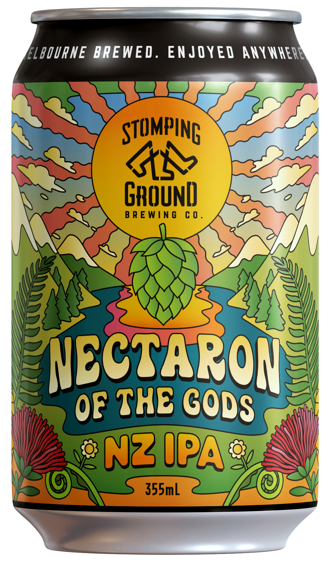
2021 WINNER
Nectaron of the Gods
Stomping Ground Brewing Co (VIC)
NZ IPA
The Nectaron of the Gods design was inspired by abstract, psychedelic illustrations from the 60s and 70s. Playing on the phrase ‘nectar of the gods’, the idea was to communicate a divine, out of this world nectar, made using a variety of hops from New Zealand, primarily, Nectaron. In creating the scene we turned to the beauty of NZ with its blue lakes and snow covered peaks, combined with a tropical, otherworldly looking landscape like the Garden of Eden. On closer inspection, you’ll find iconic NZ flora and key tasting characteristics of this magical brew.
”Great use of colour, playful illustrations and typography to give a genuinely "Groovy" feel. Well executed design which says a lot in just a quick glance.”
“Lush life affirming and other-worldly. Love how it has integrated the tropical fruit in a dreamy world. Feels like an album cover for summer.”
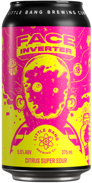
2020 WINNER
Face Inverter
Little Bang Brewing Co (SA)
Citrus Super Sour
I think the tasting note on the can sets the scene for this one…
“So you like sours, do you? Do you like "like" "sours"? Or do you really LIKE SOURS! We like sours, we really do. We like them so much we're going to see just how sour we can get this thing to go before we break something or hurt ourselves. Come along!”
Just as the beer is trying to ‘invert your face’ with mouth-puckering force, freelance designer Matt O’Connor might just be trying to pop your eyeballs while we’re at it. It’s safe to say that subtlety was not the brief. Using a digital CMYK printing process for increased versatility, Matt went with a 100% Yellow and 100% Magenta maximum contrast colour palette to tingle the eyeballs as much as the tongue. Loud, silly, even a little nostalgic, and totally on brand for Little Bang Brewing Co.
After recovering their eyesight, the Judges said…
“Jangle the eyeballs. Good one. This one ticks everything they said it would.”
“Well. It certainly does what it says on the tin! Loved the colours, illustration and the black can. They worked together really well. And even if the beer isn’t your thing, the total package adds up to a memorable experience.”
“Love this. Hits you in the face like a sour should. Pop colours will stand out on shelf immediately. It's loud, but not so crazy that you can't tell what you're looking at. You can taste it by looking at it.”
“The brash clashing colours certainly dare you to taste the sour contents within. Stands out beautifully, love the messy punk-ish aesthetic.”
“This one will stand out from the crowd with its colourful and sensorial design. It's spot on to visually describe what's inside the can and the sensation you have when trying a citrus super sour. Fantastic response to the brief, encapsulating the experience of the specific product, the brand identity in a sensorial and provocative look.”


